This project was developed at Alab Agency.
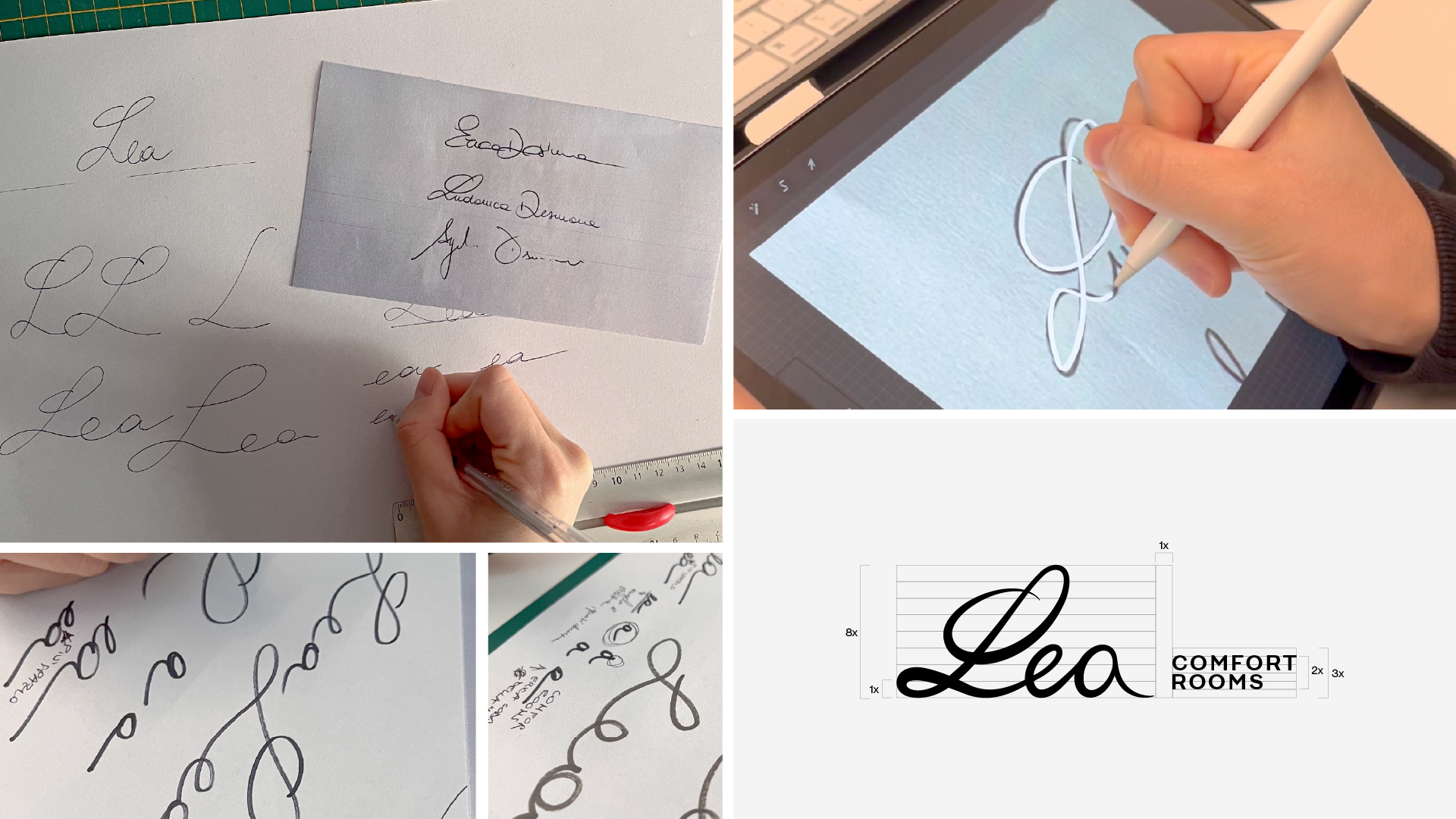
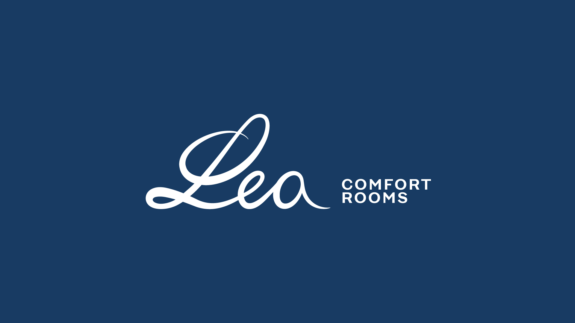
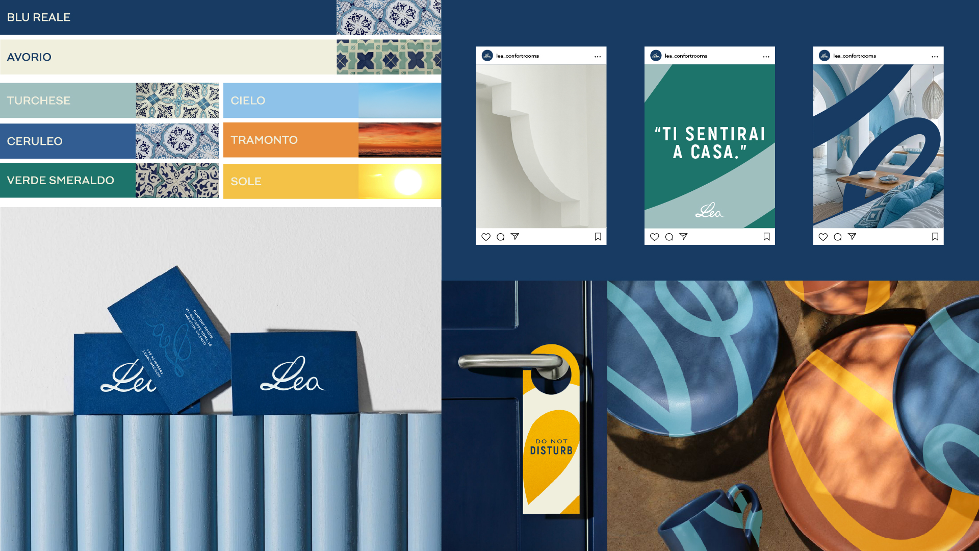
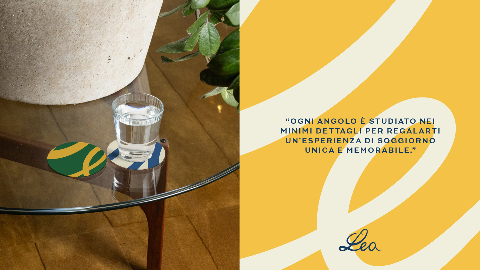
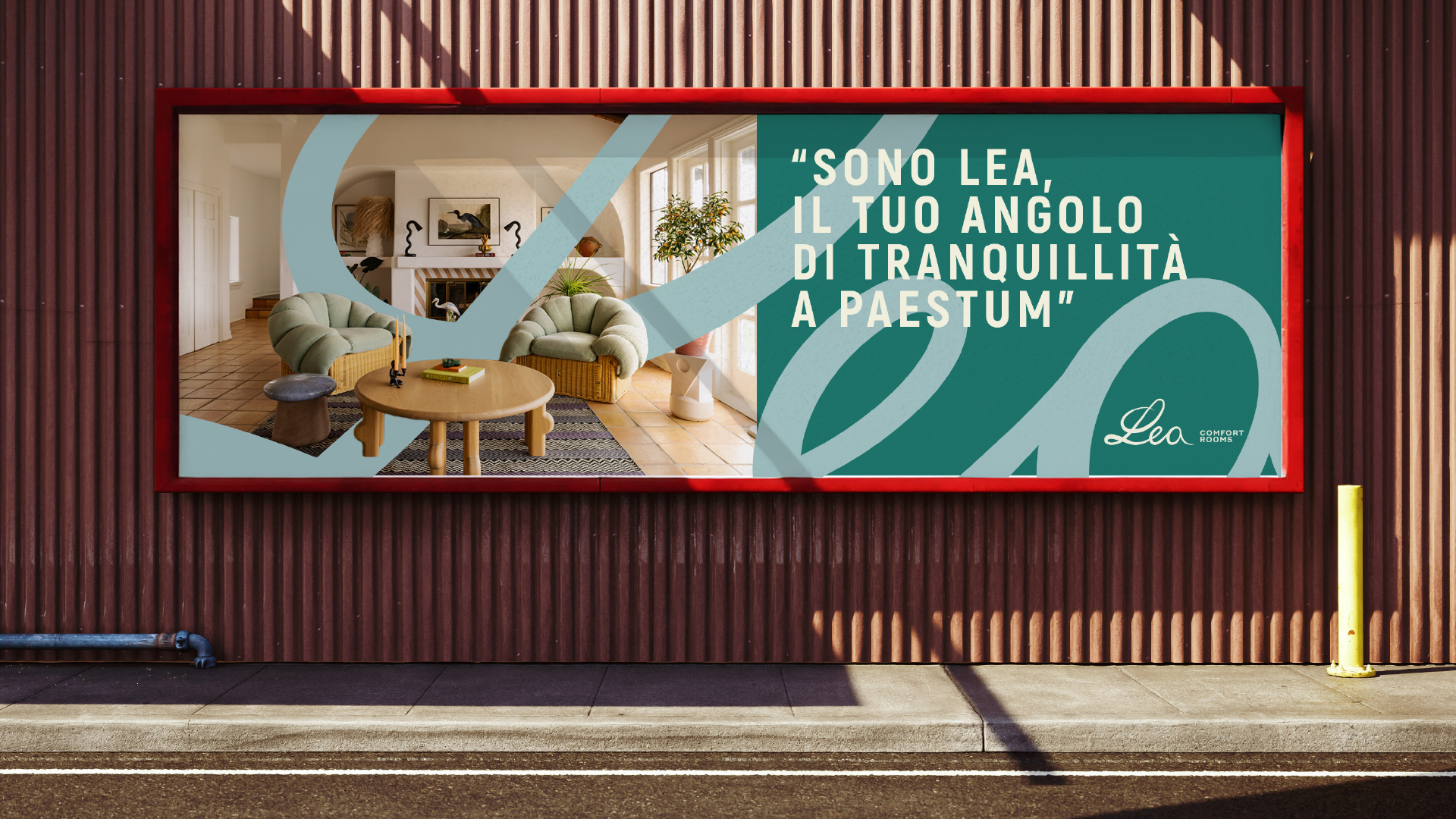
The identity proposal celebrates the strong bond between siblings, transforming the name “Lea” into a symbol of warmth, familiarity, and connection. The logo was developed through the analysis of the individual signatures, combining their distinctive characteristics into a single harmonious mark. The smooth and elegant forms, with letters flowing naturally into one another, visually express the relationship and unity between the siblings. The color palette strengthens this concept by connecting the identity to its context. The primary colors are inspired by the tones of the building’s tiles, while the secondary palette draws from the vibrant hues of the surrounding natural landscape, bringing freshness, energy, and character to the visual identity.